There Is No Special Color For WordPress Buttons That Results in More Clicks
Every website owner, blogger, marketer, and WordPress website owner who is selling products, services, courses, or programs and building an email list cares about one thing: how to increase website conversion rates. As a result, you’ll find a huge number of blog posts, articles, and infographics touting “the best button color” and the “best call to action color” to increase conversions.
Myths about Button Color
Studies, color experts, designers, and conversion experts will tell you things like:
- Red is a signal for stop. Red is a terrible call to action color. Don’t use red.
- Green is calming and represents go, so you should definitely use green for your call to action buttons.
- For the highest conversion rate, use yellow or orange for your call to action buttons because the colors are bright, cheery, and positive, and Amazon uses a yellow-orange button.
- Blue is the most trustworthy color and it helps reduce stress, so you should make your buttons blue.
These same resources will share the results of studies and tests they have run, where a website changed a button from blue to orange and website conversions increased 18%.
The problem is that almost all of these articles, conversion tests, and color tests contradict each other and the reason is simple: There is no special button color guaranteed to earn more clicks. But, while there is not one single color that is the right color for WordPress buttons or a website call to action, there is one color that is the right color for your WordPress website.
How Do You Know What Color To Make Your WordPress Buttons?
When considering the color of the buttons for your website, first consider the color palette you are utilizing.

Website Color Palette
When selecting a color palette for your WordPress website, you need to take into account these three things:
- The Brand: The website colors need to represent the brand position, feel, and message—remember, colors have meaning and that meaning needs to align with your brand.
- The Customer Persona: The website colors need to resonate with the ideal client or customer to help them connect with the brand.
- Action Color: Select one contrasting color to be the action color for your WordPress website. Use that same color when you want users to take action.
Now you can start your selection of a button color!
Website Button Color
When selecting the button color for your WordPress website, you need to take into account these three things:
- Visual Contrast: Contrast is more effective at grabbing a users’ attention that any one color because high-contrast will ensure the button stands out. For example: if the primary website colors are blue and purple, don’t use a blue or purple for the call to action button. Instead, select a contrasting color like yellow or orange for the button.
- Visual Consistency: Use your brand action color for every call to action button across your WordPress website to train visitors to click everything they see a button of that color.
- The Brand: While using a contrasting color for your WordPress buttons is critical, the color you choose also needs to remain on-brand. For example, if you’re a girly tea house with soft pink and green website, you wouldn’t use a dark navy blue button, but a bright turquoise button could do the trick nicely.
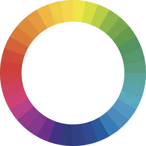
When in question on what colors complement each other well, utilize a color wheel. Colors that are directly across from each other usually work well together.

The Best Color For WordPress Buttons
Bottom line? The best color for your WordPress call to action buttons is an on-brand color that has a high contrast against your primary brand colors because the more contrast there is, the more attention the button will get. Just remember to use the same color for all of your call to action buttons for visual consistency.
Ready to Make Your Website Even Easier to Manage?
AlpineWeb’s Managed WordPress Hosting handles the updates to the platform and the plugins so you can focus on creating a stellar color palette with the perfectly selected button color!


