Where to Place Your Website’s Contact Form
Every website needs a contact page. When designing a new website at some point you’re going to to have a conversation about how prospective clients and customers are going to take the next step and contact you.
In this conversation, you’re going to need to address things like:
- Should I include a contact form on the contact page?
- Should I add the form to other parts of my website as well?
- Where is the best place to put the form so I get the best results?
Why Do I Need a Contact Page?
First things first. Every website needs a contact page because, over the years, the contact page has become one of the most expected and most visited pages on a website. The contact page is usually used to share contact information, location information, and social media information. It is where visitors know to go if they want to speak with someone or they have a question.
![]()

What are the Benefits of Using a Contact Form?
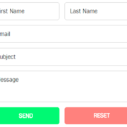
On the contact page, there needs to be a Contact Form — a way visitors can connect and communicate with you or your staff. The benefits of using a contact form on your website’s contact page is that:
- A contact form streamlines how information is provided to you
- You can require specific information you know you need up front
- You can pre-qualify, segment, and filter form submissions
- You can send them to a customized thank you page
- You can provide customized follow up based on conditional logic
While the best place to put a contact form on your WordPress website is on the contact page, that doesn’t mean it’s the only place a contact form could/should go.

6 Places to Consider Placing a Contact Form
Here are six other places on your website to consider putting a contact form:
1. The Website Footer
Most websites include important secondary information in the website footer because the footer shows up on every page of the website, but it’s at the bottom and usually understated so it doesn’t get in the way of the content consumption or conversions. This means people are already used to scrolling to the bottom of the page to find contact information, so why not place a simple contact form there as well? This way the contact form is also on every page on your website, making it easy for visitors to contact you when they’re ready to do so.
2. The About Page
If a visitor has clicked over to your about page, chances are they’re already intrigued by your products, services, course, or program and they just want to learn more about the person/people behind it. The about page is a perfect candidate for a contact form because they’re getting to know you better and the next step is reaching out to contact you.
3. Near A Call To Action
Only including a contact form on your contact page requires visitors to leave the page they are on and go to the contact page to fill out your form. Instead, leverage a popup or lightbox to show your contact form when someone clicks a link to contact you. This keeps them on the page, meets them exactly where they are, and doesn’t get in the way of the content or design.
4. At The Bottom Of A Page
Depending on the type of website you’re building, there may be natural opportunities to include a contact form at the bottom of a website at the end of the content. For example, if you’re a freelancer or agency selling WordPress websites, you most likely have a portfolio and case studies on your website. Consider adding a short inquiry form or contact form at the end of each case study or portfolio entry so your ideal clients who love your products and service can contact you right away.
5. In The Sidebar
A contact form in the sidebar of your website makes your contact form highly visible and more easily accessible across your entire website. Sidebar contact forms are also usually very minimal, which means visitors will see it as easy and quick to fill out.
6. After Blog Posts
When someone reaches the end of your blog post, it’s usually for one of three reasons: they weren’t engaged with your content and don’t really care, they read every word and love what you have to say, or they scanned the post for the highlights because they’re interested but busy. By adding a contact form at the end of blog posts, you’re making it easy for those who want to reach out and contact you.
Phew! That’s six other places on your WordPress website that you could add a contact form and potentially increase your inquiries.
Check Out Managed WordPress Hosting
If you’re a WordPress freelancer, check out our Managed WordPress Hosting plans. With WordPress pre-installed and streamlined core and plugin updates, you can focus on creating an amazing Contact Us page while we handle the hosting.


